What does a service overview dashboard in Grafana show, and which three questions should it answer at a glance?
The overall state of all services (requests per service, error rates, response times, availability), so you can see immediately which service is under most load, where errors occur and which one responds slowly.
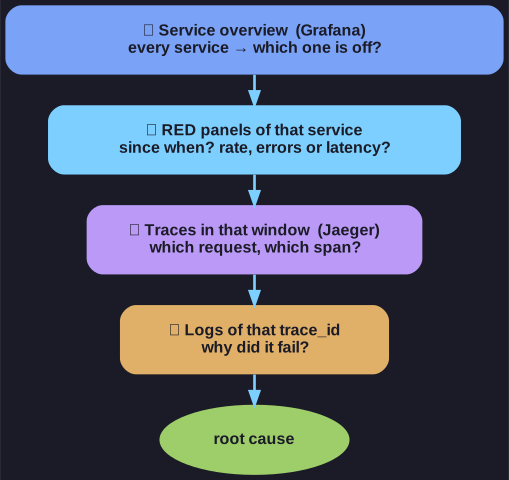
* The overview only picks the suspect; each later view narrows the search further. *
A service overview is the first screen during an incident, and it is built for triage rather than diagnosis. Its job is to narrow a system of fifteen services down to the one or two worth investigating:
- Which service carries the most load? Request counts show where traffic goes, and whether a spike is general or concentrated.
- Where do errors occur? Error rates per service point to the component that fails, or at least the first one that notices.
- Which service responds slowly? Response times, ideally as percentiles, show where users wait.
Availability completes the picture: is a service up at all.
It is deliberately not the place to find the root cause. Once the overview has pointed at "payment, error rate climbing since 14:05", you move to traces and logs for that service and time window. Grafana itself stores no data; it queries backends like Prometheus and draws the answers.
Go deeper:
 Grafana Play — public Grafana instance with live example dashboards to click through.