What are Google SRE's four Golden Signals, and why is latency usually reported as a p95 rather than an average?
Latency, Traffic, Errors and Saturation — four signals that together characterise almost any service — and percentiles are used because an average hides exactly the slow requests users complain about.
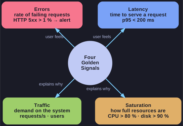
* Latency and errors are what the user feels; traffic and saturation explain why. *
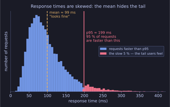
* Same data, two summaries: the mean says fine, the p95 shows the tail that generates the tickets. *
| Signal | Description | Example metric |
|---|---|---|
| Latency | Time to serve a request | p95 response time < 200 ms |
| Traffic | Demand on the system | Requests per second, concurrent users |
| Errors | Rate of failing requests | HTTP 5xx above 1% → alert |
| Saturation | How full the resources are | CPU > 80%, memory > 85%, disk > 90% |
The value of the set is that it is short enough to apply to every service you run, and complete enough that a service healthy on all four is almost certainly fine. Prioritising these four is how you avoid a dashboard with two hundred graphs that nobody reads.
Why p95. "p95 = 200 ms" means 95% of all requests were faster than 200 ms. Response times are strongly skewed: a mean of 120 ms is perfectly compatible with 5% of users waiting three seconds, because the many fast requests drown out the few slow ones. The slow tail is what generates support tickets and abandoned checkouts, so the tail is what you measure — p95 or p99, not the average.
Tip: remember the four as LTES — and note that latency and errors describe what the user feels, while traffic and saturation explain why.
Go deeper:
 Google SRE Book — Monitoring Distributed Systems — the source of the Golden Signals, with guidance on what to alert on and what to merely record.
 SRE Golden Signals Explained (IBM Technology) — a short whiteboard walk-through of the four signals.