How can a bar chart be technically accurate yet still deceive the viewer?
By manipulating the axes — truncating, inverting, or rescaling them — so the picture exaggerates or reverses what the numbers actually say.
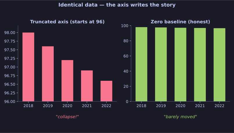
* Identical figures, two y-axes: the scale, not the data, tells the story. *
The data can be 100% correct while the visualisation lies. Common tricks:
- Truncated y-axis: start the axis at, say, 95 instead of 0, so a tiny difference looks like a cliff.
- Inverted axis: put 0 at the top, so a rising line reads as falling (and vice versa).
- Cropped or stretched scales: zoom the range to amplify a trivial change, or compress it to hide a big one.
- Cherry-picked baseline: index everything to a hand-picked start year so growth looks huge or tiny.
The viewer's eye trusts the shape, not the axis labels — which is exactly what the manipulator exploits. The fix is to always read the axes: where does the scale start, what are the units, what's the baseline.
Tip: A bar's height should be proportional to its value. The moment the axis doesn't start at zero (for a bar chart), the proportions lie even though every number is real.
Go deeper:
 Misleading graph — a catalogue of axis tricks with real before/after chart examples.